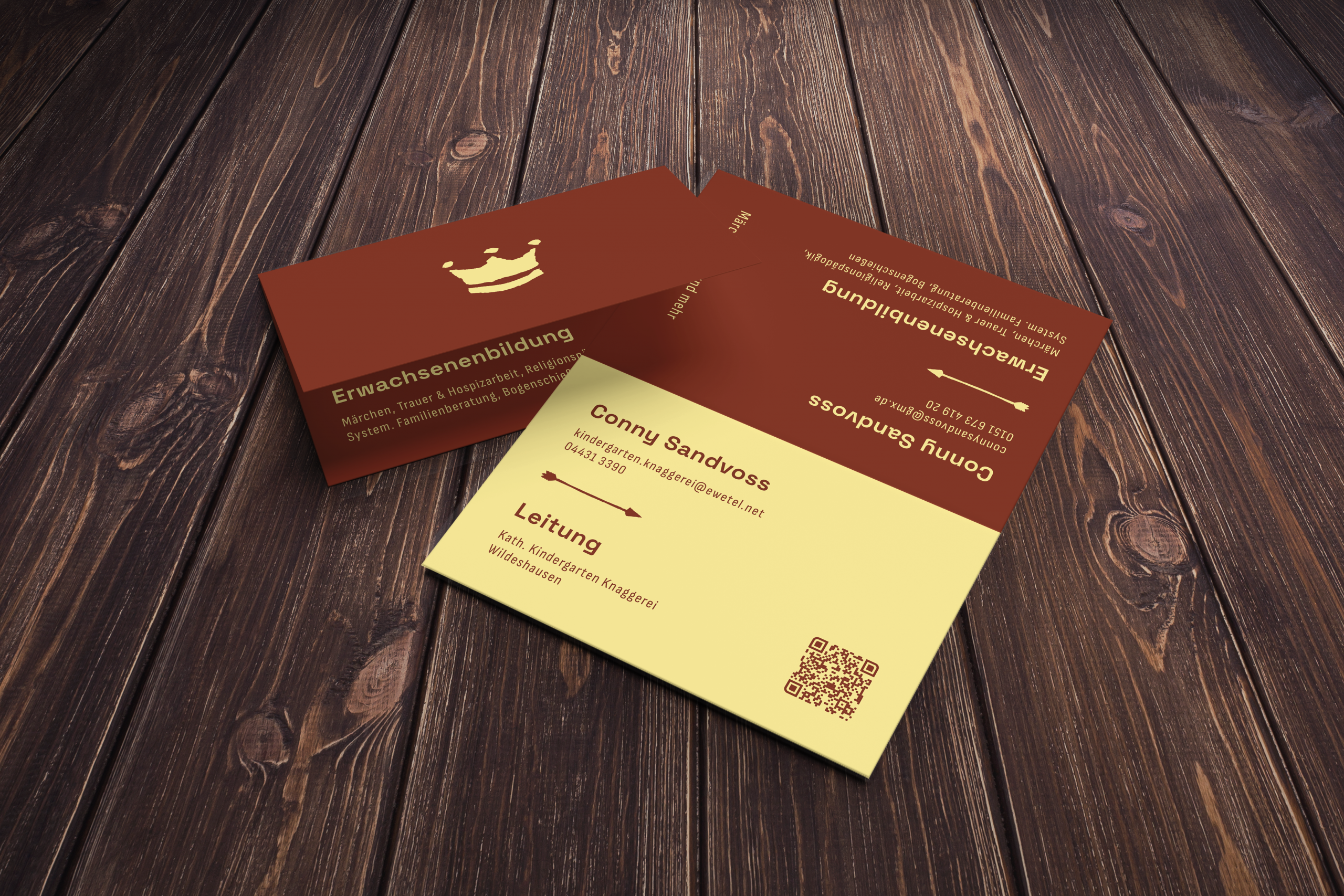
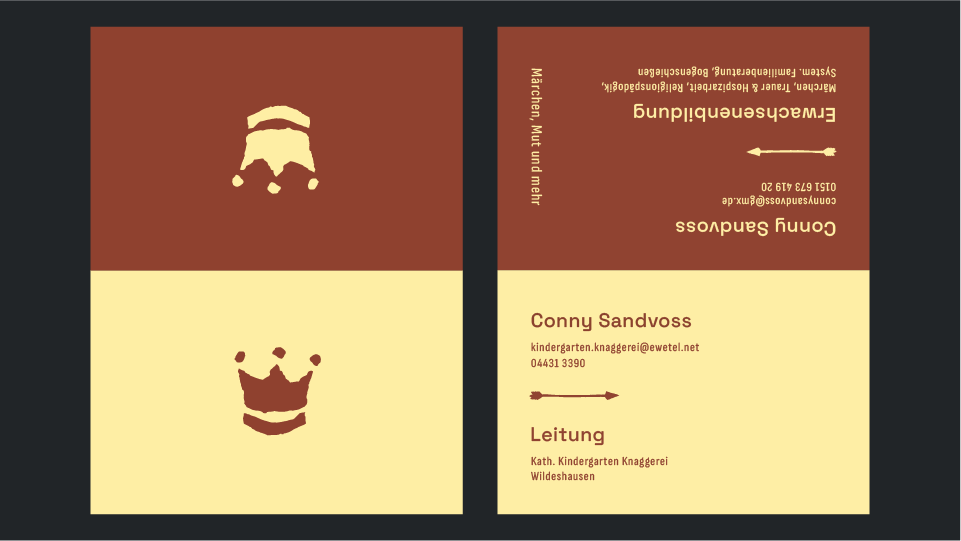
Conny Sandvoss is the head of the Catholic Kindergarten Knaggerei in Wildeshausen and works independently in adult education. She requires business cards that combine both areas of her work. Each area should have its own contact details, including separate email addresses and phone numbers. There should also be either an explanatory text or a QR code.
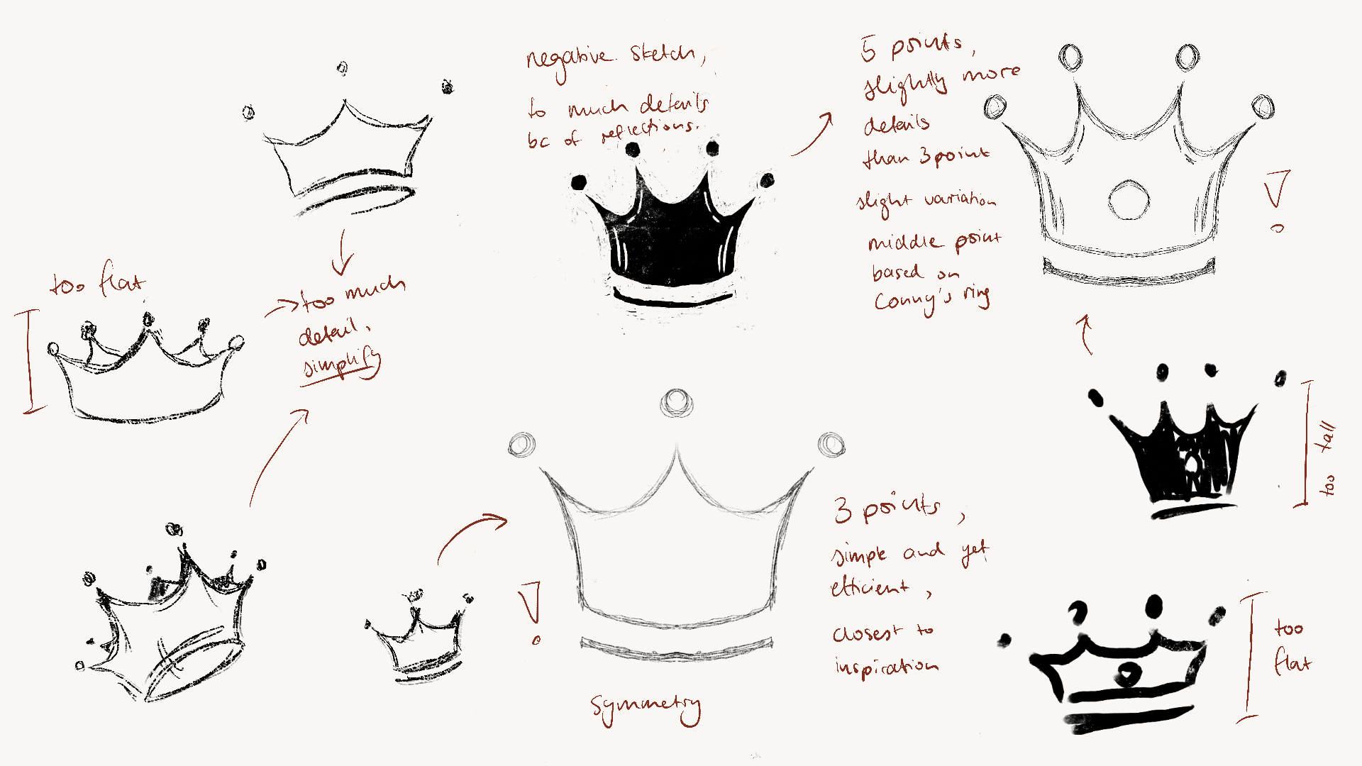
Throughout her career, Conny has adopted the symbol of the crown. In Christian symbolism, the crown represents the dignity of every human being, the duty to care for others and the concept of leading through compassion rather than authority. In addition to her personal connection to the symbol, its historical and religious meaning makes the crown an ideal logo for her.
She is also interested in medieval culture and fairy tales.
Elisabeth Schenk
2025
Playful yet professional, childlike yet mature, timeless yet with a subtle historic touch, and, above all, warm and welcoming.
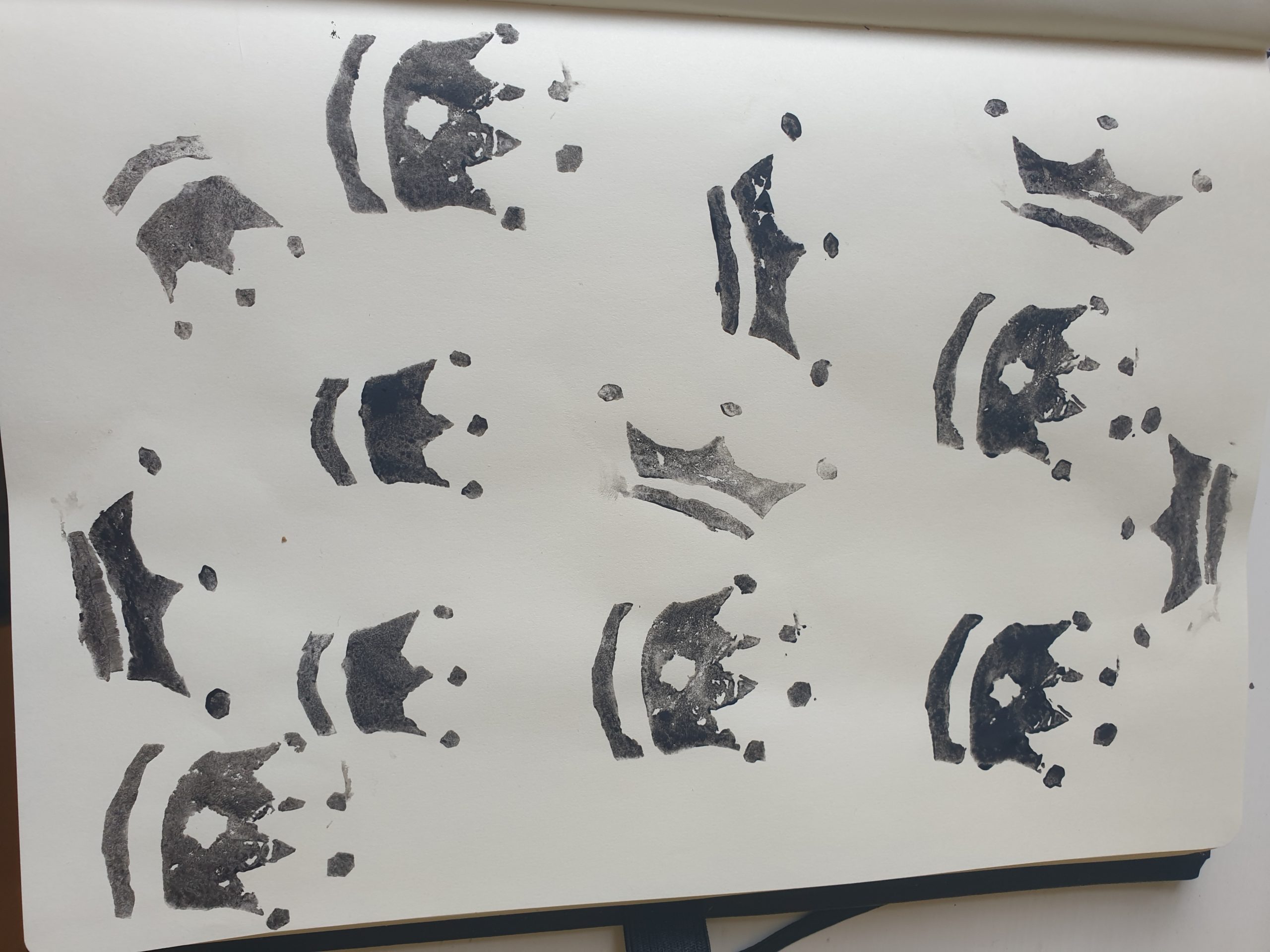
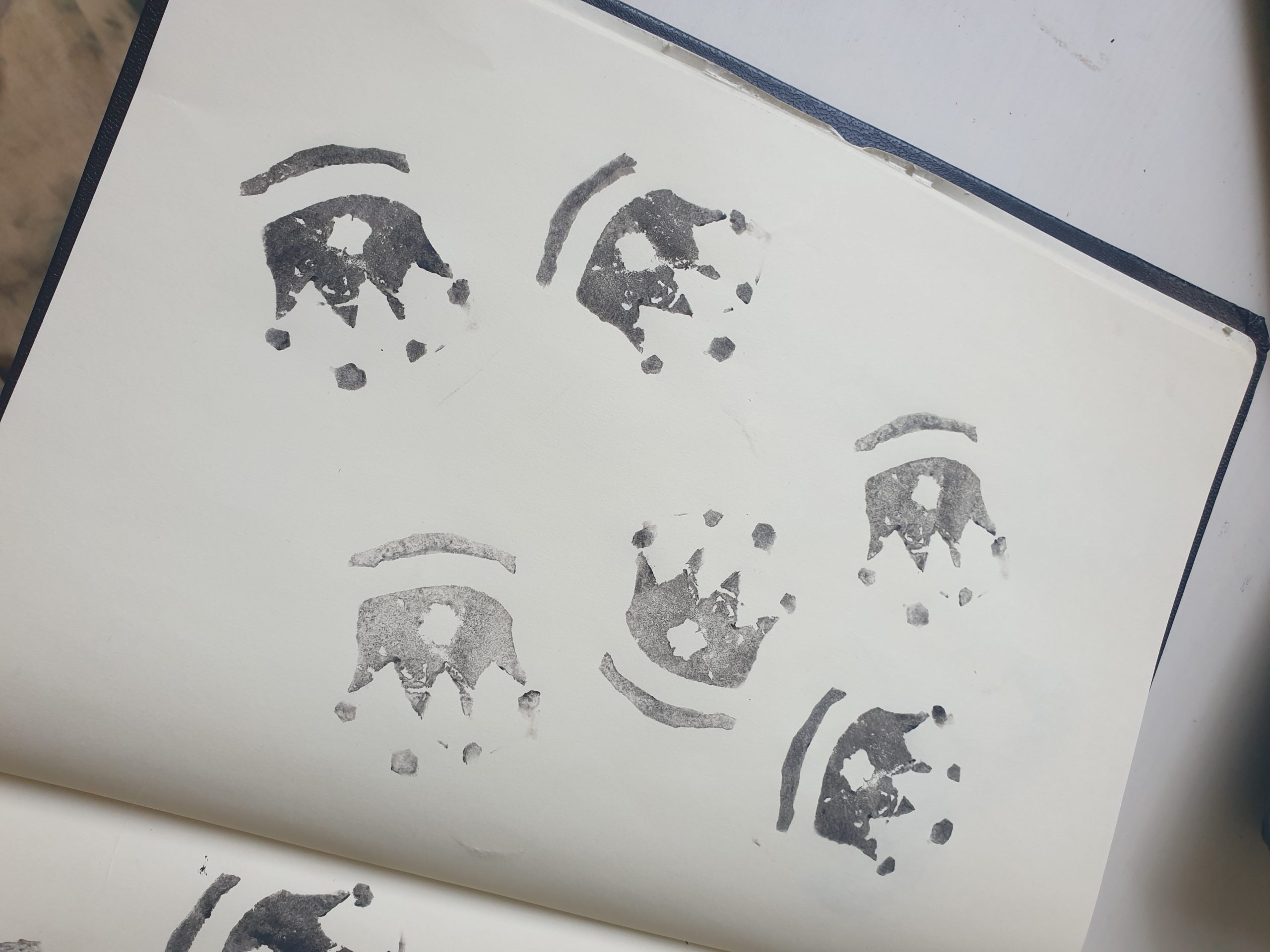
The logo’s design was inspired by Conny’s work with children. It was created using potato stamping, a technique often used with children to make simple, original stamps. First, I sketched multiple variations of simple crowns in Procreate, before copying the illustrations onto potato slices and carving out the negative space to create stamps. I then used acrylic paint to stamp the designs onto paper.
Those handmade stamps were digitized in Photoshop and then refined in Illustrator.
This process preserves the imperfections and childlike character of the original stamps, while making them suitable for professional use and creating a unique visual language that reflects her brand’s established characteristics.
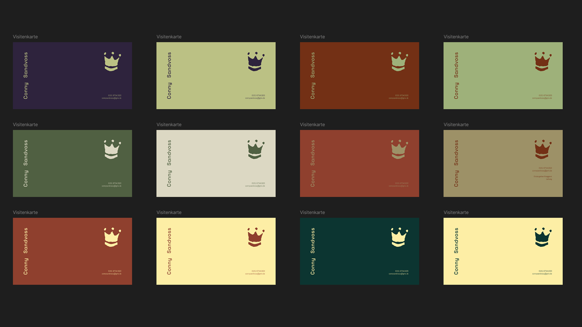
Typography and Colors
The selected typeface is the sans-serif font Space Grotesk. It features round bowls combined with sharper edges, a slightly condensed width, and monoline stroke weights, giving it a contemporary and clear appearance. At the same time, its playful proportions prevent it from feeling sterile or overly technical.
Particularly distinctive are the shapes of the y and g, which use subtle edges rather than soft curves. These details introduce a gentle historic undertone and create a recognizable visual signature.
The secondary typeface was chosen to echo the rounded forms and monoline structures of the primary font in order to ensure a coherent and harmonious visual representation.
The color palette is based on warm, inviting tones through a yellow–red combination to clearly reflect Conny’s two professional fields. Additional experiments included green and purple as contrast colors.
Yellow represents the kindergarten: happiness, sunlight, warmth, and childhood. Red, used in a slightly darker and more muted tone, represents adult education: maturity, stability, and reliability.
The business card is designed as a foldable format. Depending on which side is facing up, the opened card reveals the corresponding color and information area. This creates a small moment of interaction between the card and the recipient, guiding attention and focus while intuitively separating both professional fields.