Auraya
Auraya is a digital space for mental self-development. It combines neuroscience-based methods, AI-guided reflection and music-supported exercises to support emotional stability, clarity and self-trust in everyday life.
Auraya is an ongoing and constantly evolving freelance project. The long-term goal is a fully developed app, accompanied by social media and printed materials.
At the moment, the focus lies on completing the brand board and developing a low-fidelity prototype.
since Oktober 2025
Luka Sandvoss & Elisabeth Schenk
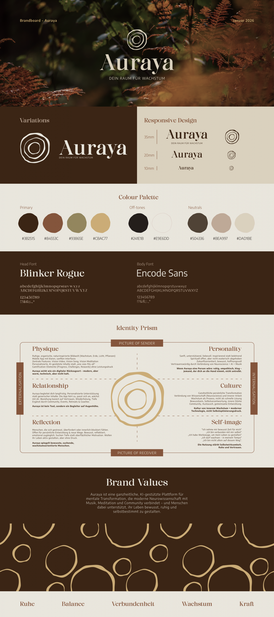
Brandboard
The CEO’s vision combines retro-inspired design with nature-connected, minimal and elegant forms.
Calm, abstract and softly surreal elements are used to convey connectivity, inner strength, boldness and a gentle shift in perspective.
The primary typeface is an elegant serif font. Its serifs provide stability and refinement, while strong bowls, rounded shapes and dynamic curves create a sense of movement and a natural, flowing character.
The body typeface is a clean sans-serif font that reflects the curves of the headline font and ensures high readability within the app interface.
A competitor color analysis showed that many comparable brands rely heavily on bluish and purple color directions.
To clearly differentiate Auraya, the visual identity therefore focuses on warmer orange, red and brown tones, supporting the natural, earthy aesthetic defined in the CEO’s vision. The color system is designed to be flexible and adaptable. Off-white base tones, natural secondary colors and functional system colors remain consistent, while the primary seasonal color can shift subtly throughout the year.
Based on this, the headline typeface was cut and refined into a harmonized logotype. All proportions were adjusted according to the Fibonacci scale.
The logo itself is inspired by the visual impact of water forming expanding circles. It references nature, symbolizes growth in an abstract way, reflects common visualizations of the soul or aura, and can also be interpreted as a portal.
Multiple water-impact variations were first sketched, then digitized and simplified, focusing on three core circles. These forms were finally reconstructed and refined using Fibonacci-based proportions.
The logo also serves as the foundation for future design applications, including patterns, icons, stickers and wax seals.
This could also interest you:)
Schattenmaler
University – Project 1
Fractal
University – Projekt 2
AROS
University, AIxDesign – VR Experience

Schattenmaler
University – Project 1

Fractal
University – Projekt 2

AROS
University, AIxDesign – VR Experience