
Wedding Invitation
I was commissioned to design wedding invitations as a freelance job.
The wedding’s overall theme is inspired by wildflowers in a rustic farm setting during the warm summer months, with a party atmosphere.
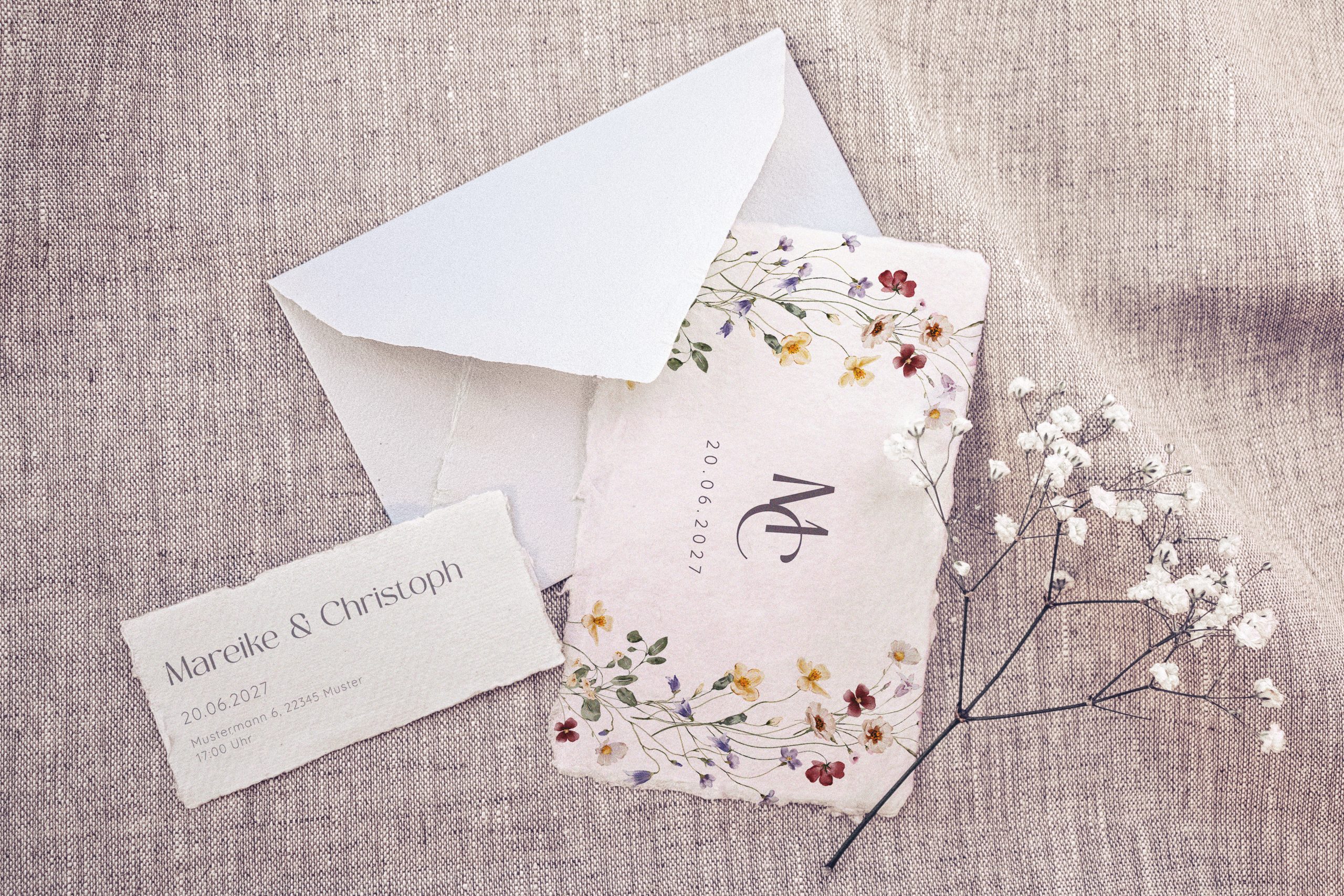
The bride wanted the invitation to be simple and unadorned, with a pure design that guests could hang on their fridge. She liked the idea of natural, textured, rough paper with an organic, handcrafted feel. To fit the theme and her dress, she wanted a realistic watercolour illustration of a bundle of wildflowers in soft, slightly muted but colourful tones.
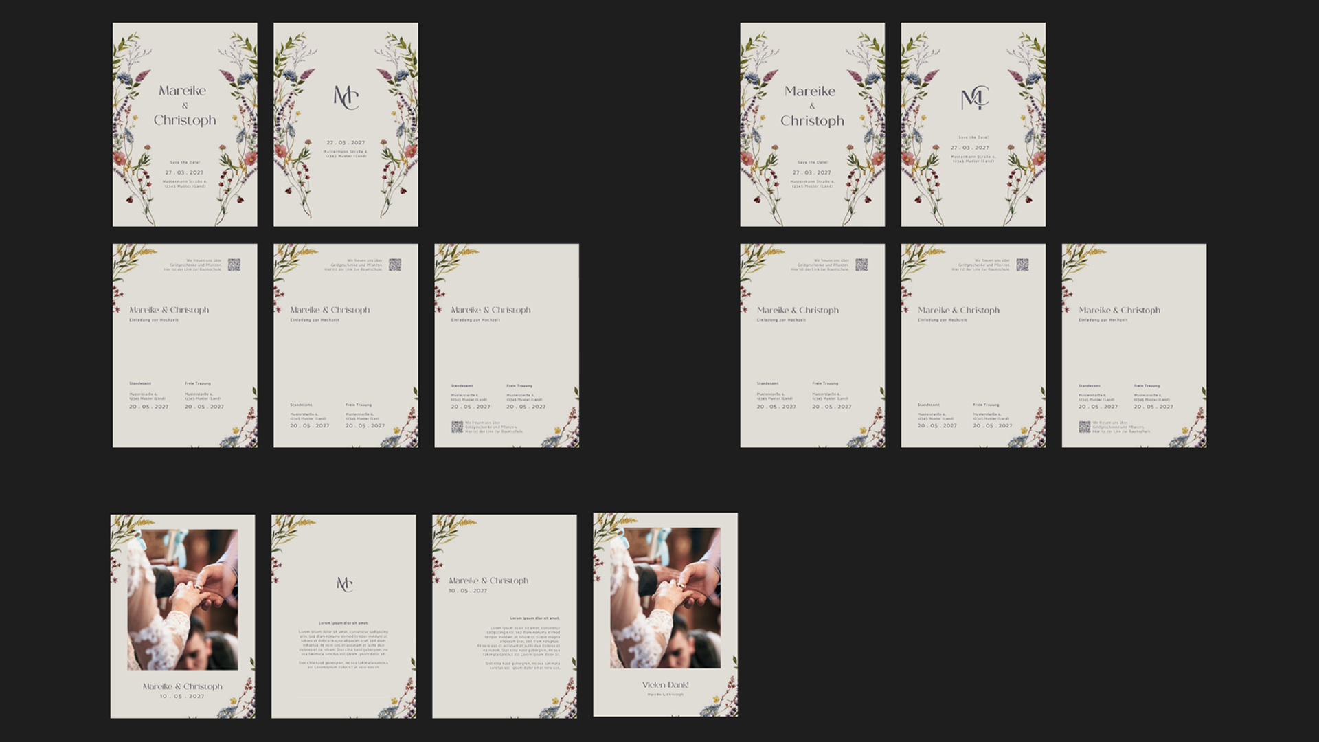
Based on this, I came up with two initial concepts. The first was a simple A6 card with a minimal and straightforward design, offering space for handwritten messages on the back, closely resembling her inspirational board.
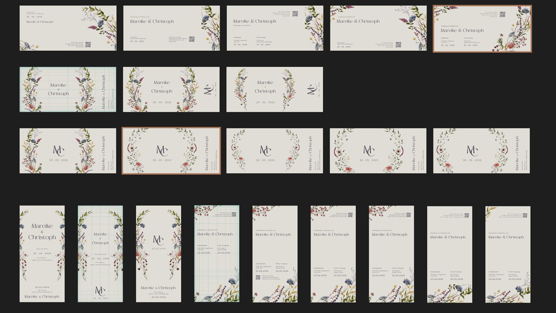
The second idea was a summer ticket with a rip-off part in a DIN long format.
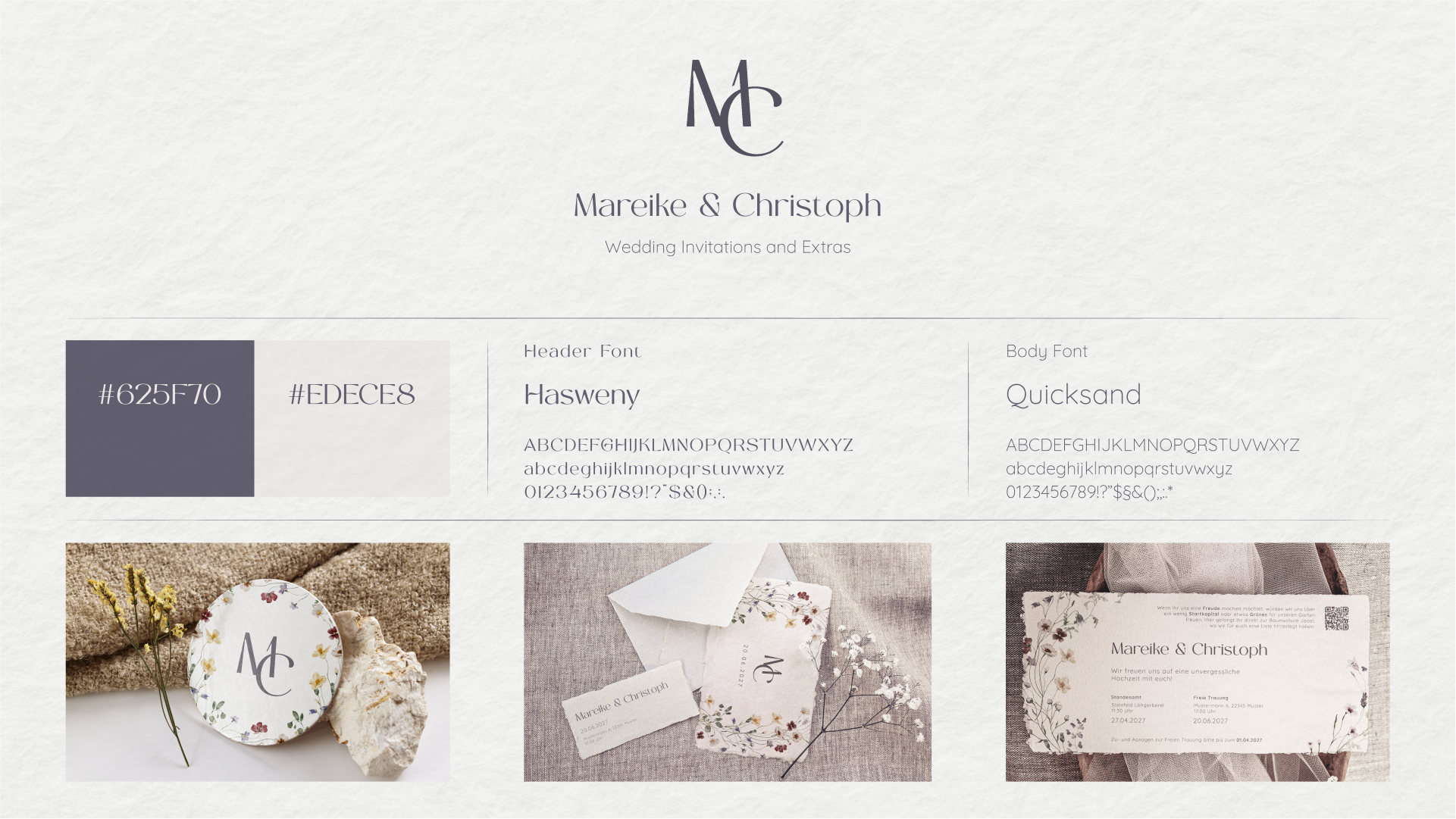
Branding
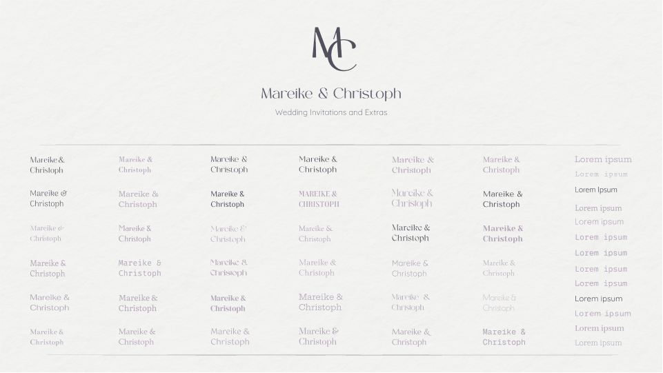
The first step was to find a suitable font and colours with which to create the initial designs. As I said, we were looking for a warm, rustic colour palette, with the flowers providing the actual colours. So I needed a font colour that would create enough contrast with the future paper, while also harmonising with the flowers. I therefore decided on a dark purple for the text.
For the font, she wanted something soft and floral, and for the body font, something that felt a little like a typewriter.
I found that the Hasweny font was a perfect fit, and Quicksand was ideal for the body text.
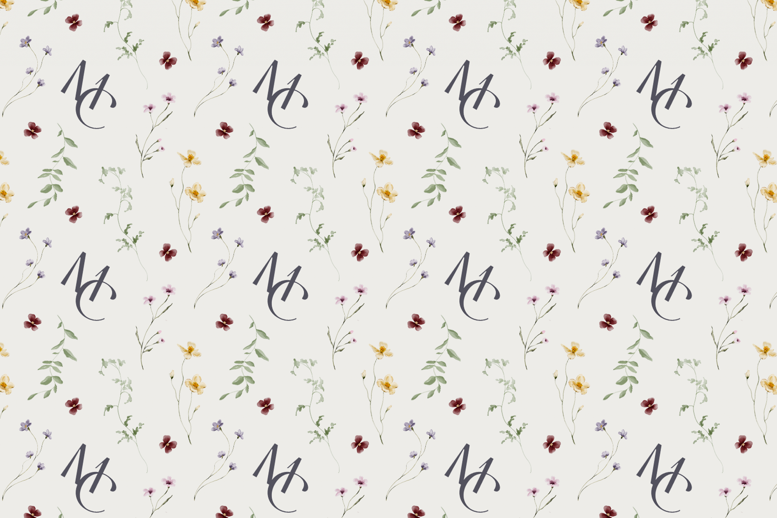
After selecting the fonts, I worked on finalising their logo, which is a combination of the first letters of their names, M and C. The idea behind this was, on the one hand, variability and non-repetition, and, on the other hand, expandability, we could use this logo for many more designs, such as stickers, wax seals or patterns.
First Designs
For the first design explorations, I developed both initial concepts: a simple A6 invitation and the summer ticket format.
I tested both formats with various layouts, experimenting with different text compositions, logo placements, and visual hierarchies.
We decided on the horizontal format, which I then used as the base for further refinement, adapting the colour palette and floral illustrations accordingly.
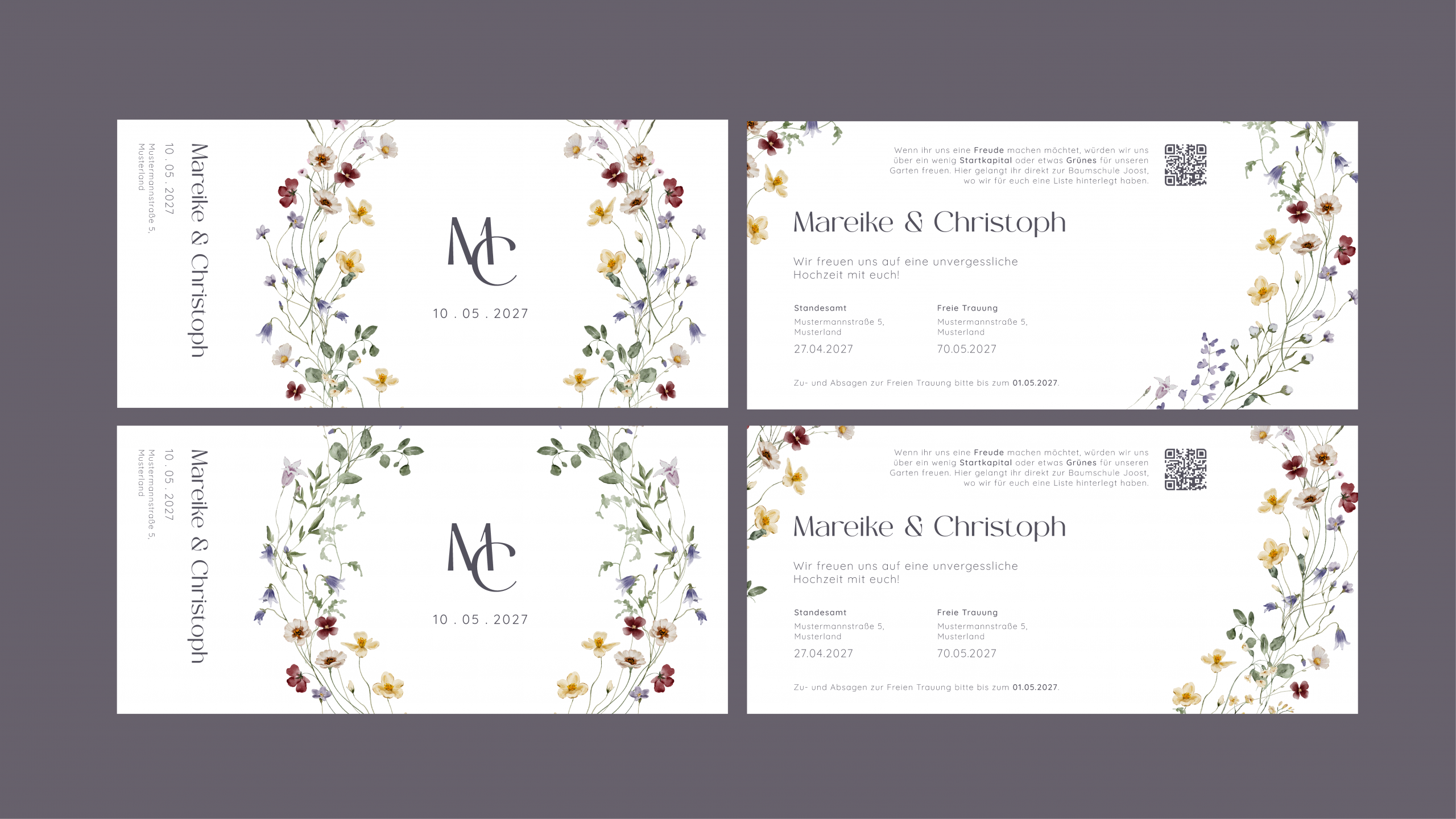
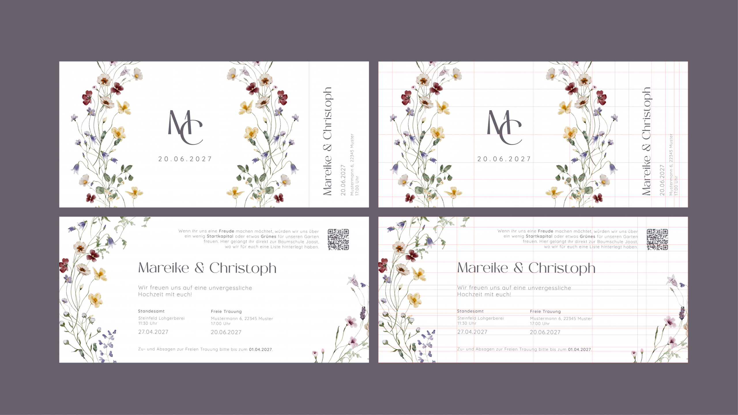
Final Variations
Based on my design variations, I developed two clean final options in InDesign, both structured on a golden ratio grid.
The summer ticket format offers several thoughtful features. The invitation fits into a simple DIN long envelope, making it easy for the couple to send. The ticket format also adds a small interactive element that sparks curiosity and helps the invitation stand out and be remembered.
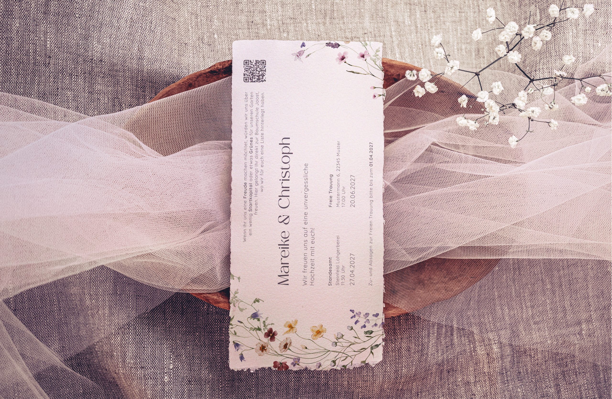
The front side immediately communicates the style and intention of the wedding. Once the ticket is torn apart, both pieces clearly define their purpose.
The larger section becomes a decorative keepsake that can be hung up, while its back contains detailed information about the schedule, the two wedding celebrations, gift preferences, and RSVP deadlines.
The smaller tear-off piece presents all essential information at a glance – who, where, and when – and features floral decorations on the back. If desired, the couple can also use this smaller section as a simple control or check-in element.
For the final refinements, I adjusted the order of the two sections to follow the natural left-to-right reading flow. This places the visual focus first on the larger ornamental centrepiece and second on the tear-off element, creating a balanced and intuitive layout.
Extras
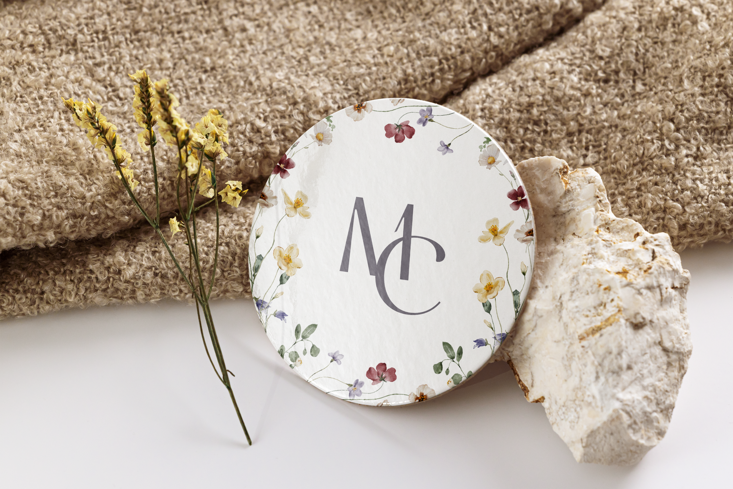
I enjoexyd the theme and easthetic of the wedding, making me wanting to keep working on it. So in addition to the invitations, I tried to create patterns in Photoshop containing the logo and the foral ornaments.
I also created some sticker designs and coasters. This is a work in progress, so there will be additions and further developments before and after the wedding. 🙂
This could also interest you:)
Schattenmaler
University – Project 1
Fractal
University – Projekt 2
AROS
University, AIxDesign – VR Experience
Schattenmaler
University – Project 1
Fractal
University – Projekt 2
AROS
University, AIxDesign – VR Experience